Product
HireU.ai
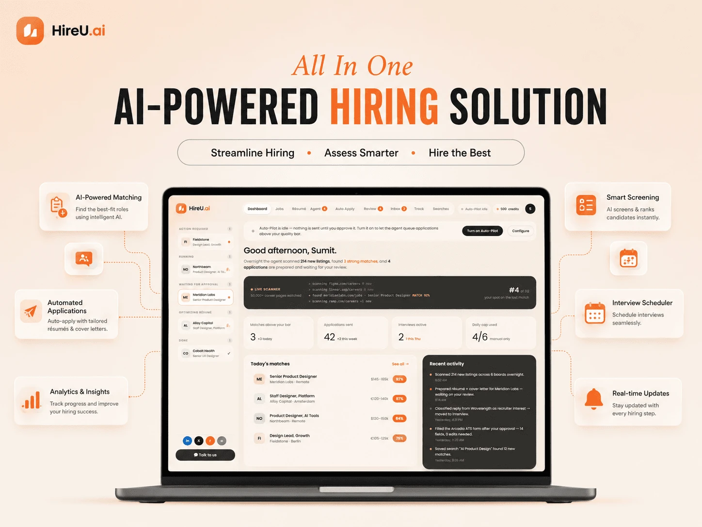
HireU.ai brings job discovery, résumé customization, form-filling, and recruiter tracking into one AI-guided workflow — where candidates hand off repetitive work to AI while feeling completely in control of their career.
CASE STUDY 0→1 product design · Real interface — no shipped business metrics
HireU.ai brings job discovery, résumé customization, form-filling, and recruiter tracking into one AI-guided workflow — where candidates hand off repetitive work to AI while feeling completely in control of their career.
Illustrative interface status: application sent — Meridian Labs · 92% match · Senior Product Designer. The Auto-Pilot scanning volume is concept interface data, not a measured operating result.
HireU.ai
0 → 1 product design
Web, mobile, desktop, agent
Product / UX designer
Active job seekers
Find → Match → Prepare → Review → Apply → Track
In practice, a single application hides more than a dozen manual steps — and each one repeats, unchanged, for every role a candidate considers.
Choice A · High volume
More applications sent, but personalization drops with every extra one.
Choice B · High personalization
Stronger, tailored applications — at a cost of significantly more time.
Can AI remove the repetitive work without removing the candidate from the decision-making process?
Active job seekers struggle to manage the volume, personalization, and repetitive effort required to apply for relevant jobs — because no single product owns the full journey.
Recent graduates, career changers, and experienced professionals arrive with different backgrounds, but converge on the same complaint: the process takes too much time. Sumit represents that convergence.
Proto-persona
Sumit
Senior Product Designer
32
Age
9+
Years exp.
"I keep finding jobs, but applying takes forever."
"I want AI to help me, but I don't want it changing things without telling me."
"I don't want to send the same résumé everywhere."
Core need
Automation without losing control.
What the map revealed
Reading the four quadrants together exposed the real tension: Sumit isn't asking for less effort — he's asking for less repetition . Every behavior in "Does" is a workaround for a tool that forgot him, and every worry in "Thinks" is about representation, not speed. That's why the design brief became automation without losing control : the agent could take over the mechanical work, but authorship — what employers actually see — had to stay visibly, provably his.
“This application is asking for the same information again.”
“What exactly did the AI change?”
“I spent my whole Sunday applying and heard nothing back.”
“I wish someone would just tell me which roles are worth it.”
Is this job worth applying to?
Will ATS reject my résumé?
Did the AI represent me accurately?
Am I applying to too few — or too many?
If I automate this, will it still sound like me?
Searches job boards, saves roles
Repeats application info by hand
Checks email, tracks in a spreadsheet
Keeps 4–5 résumé versions in a folder
Copies old cover letters and rewrites the first line
Overwhelmed and time-constrained
Cautiously optimistic about AI
Anxious about applications going silent
Protective of how he’s represented to employers
Mapping today's workflow against the proposed one made the opportunity obvious: reduce eighteen manual steps into a handful of reviewable decisions.
Today — search to spreadsheet
HireU.ai — find to track
Search jobs across platforms
Read description, assess fit
Edit résumé by hand
Write a new cover letter
Fill application, upload documents
Write open-ended answers from scratch
Save to a spreadsheet, check email, repeat
Agent surfaces matches with explained scores
Agent prepares résumé, letter, and answers
User reviews every change before it’s true
User approves, agent handles the ATS form
Agent tracks the reply automatically
The goal was to reduce repetitive actions, cognitive load, and uncertainty around AI — without ever taking authorship away from the candidate. Four principles kept that goal honest.
The interface always communicates what happened, what happens next, and what the user needs to do.
Automation never means generic output — every generation draws on résumé, JD, and prior applications.
Users always see what changed, why it changed, and what’s about to be submitted.
AI does the work. The candidate owns the outcome — full stop.
Show better matches, not more listings.
Let AI customize existing candidate material.
Remove unnecessary manual data entry.
Build trust through transparency, not claims.
Replace spreadsheets with one pipeline.
Turn recruiter email into pipeline context.
Rather than jumping to a solution, I stress-tested narrower ideas first — each one solved a slice of the problem, but only one addressed the complete workflow.
↺ Track feeds back into Find — the loop continues
Easy to understand
Doesn’t solve applying
Strong personalization
Still applies manually
Maximum automation
Low trust, no control
Owns the full workflow
Control built in by design
Status
AI acts at three levels
Auto — reversible Suggest — you pick Approve — you send
The concept uses standing search agents to surface new roles overnight. The 50,000+ career-page volume shown in the interface illustrates the intended scale; it is not a measured scanning result.
Each role gets an explained score — what your profile covers, and what it doesn’t.
The agent tailors résumé, cover letter, and answers against the specific job.
Every change is shown as a visible diff. Nothing is true until you approve it.
On approval, the agent handles the ATS form and submission.
Replies, stages, and recruiter threads land in one pipeline — automatically.
Approve everything and the agent stops saving time. Approve nothing and trust collapses. So every action was sorted into one of three levels before a single screen was drawn.
The trust loop
A cycle repeated on every AI action.
Job discovery
Match scoring
Status tracking
Email classification
Résumé edits
Cover letters
Application answers
Final submission
Sensitive information
Profile changes
Example: the agent files a recruiter reply under the right application — no confirmation needed.
Example: a résumé line is rewritten and shown as a diff — applied only after you accept it.
Example: nothing is ever submitted to an employer without a deliberate, per-application approval.
These are the actual product screens, not mockups. Each screen is annotated with what it's doing for the candidate and why it was built that way.
Résumé — experience section preview
Designed digital products for enterprise clients. enterprise SaaS products for global financial organizations.
Why this change: the job description emphasizes enterprise SaaS and financial services experience.
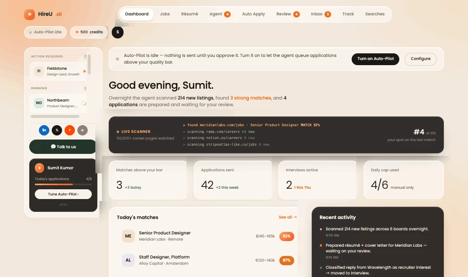
The daily briefing — Auto-Pilot banner, stat cards, and today’s matches
Entry point
The product never opens on an empty state or a raw list. It opens on a sentence: what the agent scanned overnight, how many strong matches it found, how many applications are out, and how many interviews are active right now.
Auto-Pilot status shown as an explicit banner, not a silent default — it states plainly that it’s idle until turned on
Four stat cards: matches above bar, applications sent, interviews active, daily cap used
“Today’s matches” ranked by how much of the role the profile already covers
“Recent activity” narrates exactly what the agent has done, in plain language, with timestamps
Before the candidate decides anything, they know the current state of their search — no digging required.
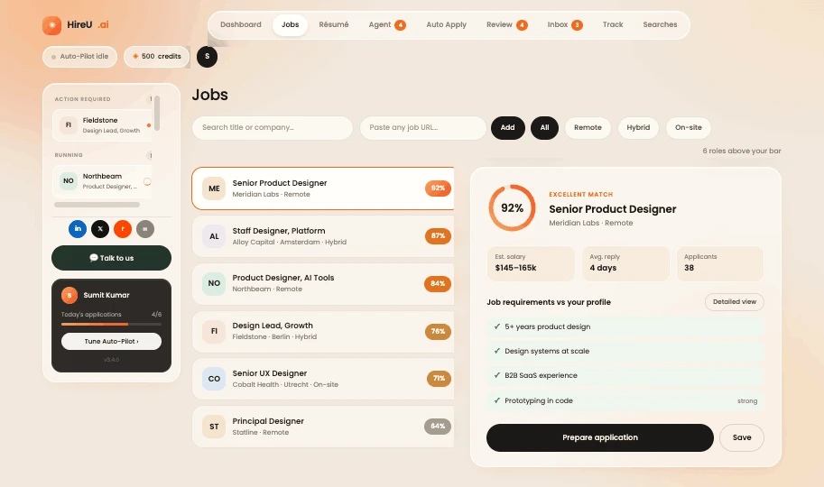
Jobs — match ring, salary, and reply-time reasoning attached to every role
Find + match
Filtering feels like any job board, but the moment a role is selected, the right panel stops being a listing and starts being an argument for or against applying: match score, estimated salary, average reply time, and how many people are already competing for it.
Match score rendered as a ring with a plain-language read (“Strong”), not just a raw number
Est. salary, average reply time, and applicant volume shown alongside the score, not buried in the description
“Job requirements vs your profile” comparison, toggled between summary and detailed view
Standard filter bar — title, location, salary, workplace — kept familiar on purpose
The candidate can judge whether a role is worth fifteen minutes of review before opening it.
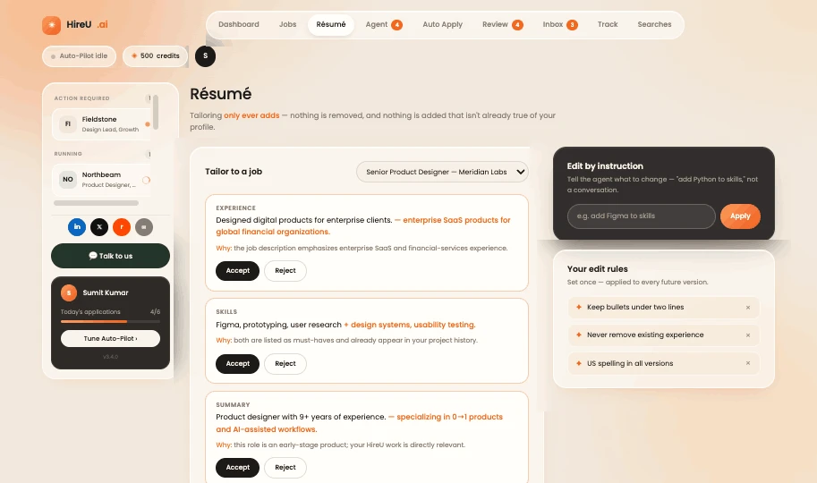
Résumé tailoring — additive-only changes against a saved match
Prepare
The single most important sentence on this screen isn’t a headline, it’s a rule: tailoring “only ever adds — nothing is removed, and nothing is added that isn’t already true of your profile.” That’s a trust boundary stated as plainly as possible.
“Tailor to a job” applies changes against a specific saved match, never generically
“Edit by instruction” is instruction-based rather than open-ended chat — “add Python to skills,” not a freeform conversation
“Your edit rules” persist across every future version, so a constraint like “keep bullets under two lines” only has to be set once
A constraint stated in plain language does more trust-building than any settings toggle could.
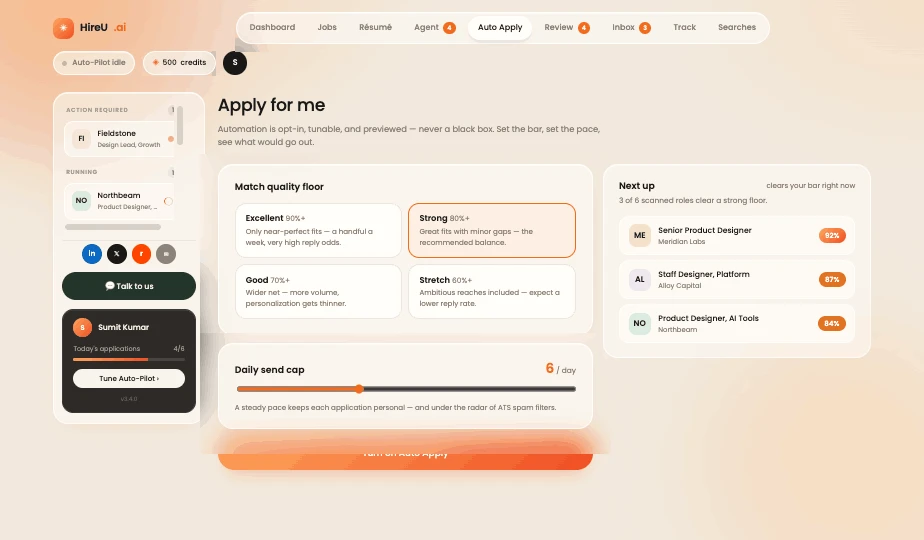
Auto Apply — quality floor, daily cap, and a live preview of what queues
Automate
This is the human-in-the-loop framework turned into an actual control surface. Instead of a single on/off switch, the candidate sets a match-quality floor and a daily send cap, previews exactly what would queue, and only then opts in.
Match quality floor — Excellent / Strong / Good / Stretch — with a one-line consequence for each choice
Daily cap slider, explicitly warning that a high volume in a short window reads as bot behavior to employers
“Next up” shows the real jobs that clear the bar right now, before automation is switched on
“Turn on Auto Apply” is a deliberate action, never a default state
Automation is opt-in, tunable, and previewed — never a black box the candidate has to trust blindly.
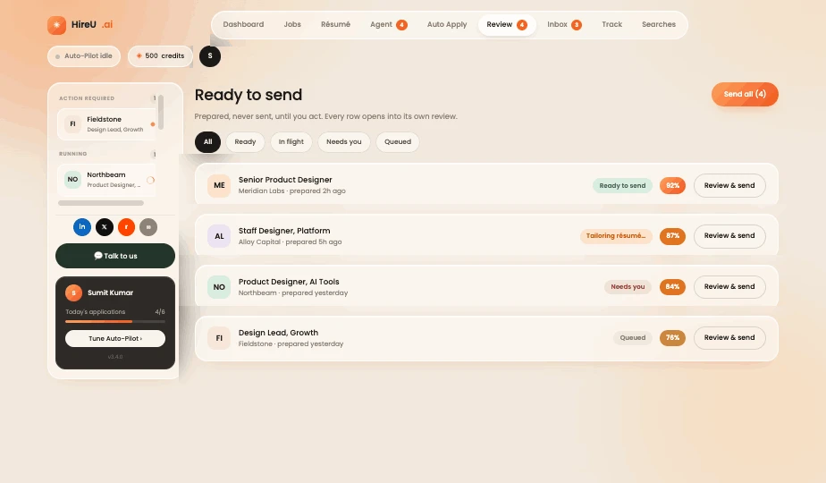
Ready to send — every prepared application waits for a human
Review
Every application the agent has finished preparing lands here first, not in an outbox. “Send all” exists for speed, but each row still opens into its own review before it can go out.
Match score shown per application, so the strongest candidates for approval are easy to spot at a glance
“Prepared” timestamp shows how long an application has been sitting, waiting on the candidate
Bulk “Send all” sits next to individual “Review & send” — speed and control offered side by side, not traded off
This is the medium-risk tier from the trust framework, built as an actual screen — prepared, never sent, until a person acts.
Track / Applications — the spreadsheet, retired
Track
Every application, regardless of how it was sent, lands in one table with a clear stage and a last-update timestamp — the exact structure candidates were building by hand before.
Stage shown as a plain badge — Applied, Interview, Rejected, Confirmed — colored for a fast scan
“Last update” surfaces which threads have gone quiet and which are actually moving
Applied date kept visible so nothing sits forgotten for weeks unnoticed
Replaces the manual spreadsheet with the same at-a-glance scan, populated automatically.
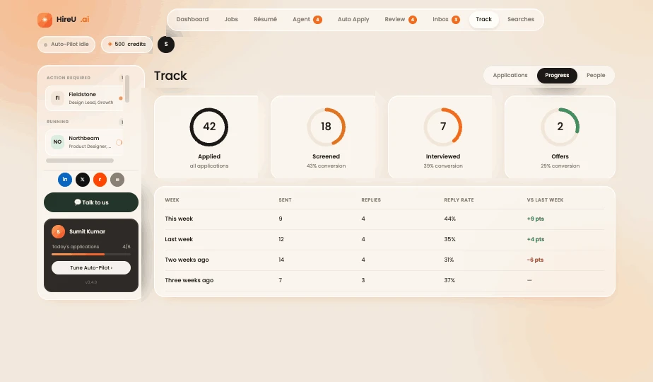
Track / Progress — the funnel, week over week
Track
Application count on its own hides where a job search is actually leaking. This screen reframes the question from “how many did I send” to “where does the funnel narrow,” week over week.
Four stages as rings — applied, screened, interviewed, offers — each with its own conversion rate
Weekly funnel table shows sent versus replies, with a week-over-week delta on reply rate
Deltas colored to show improvement or decline at a glance, without needing to do the math
A healthier way to read a job search than raw volume — it points at what to adjust, not just what happened.
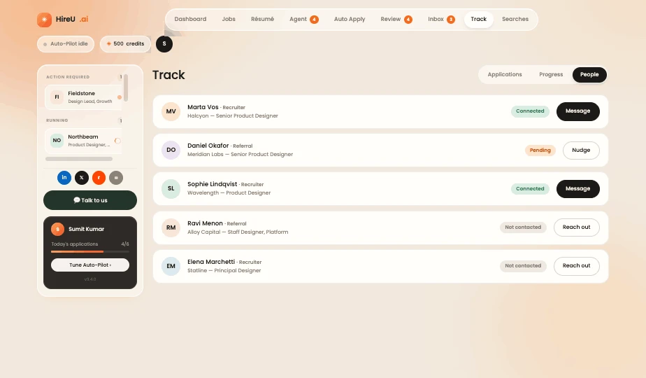
Track / People — recruiters and referrals as a pipeline
Track
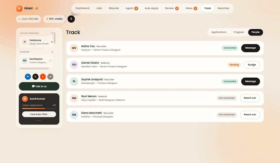
A job search isn’t just a stack of forms — it’s a set of half-started conversations with actual people. This screen tracks recruiters and referrals the same disciplined way the pipeline tracks applications.
Each contact tied back to the specific company and role they’re connected to
Status shown honestly — Connected, Pending, Not contacted — instead of collapsing everyone into one inbox
Action button adapts to status: “Message” once connected, “Reach out” when it hasn’t started yet
Nudges the candidate toward the specific next move for each relationship, not a generic “check your inbox.”
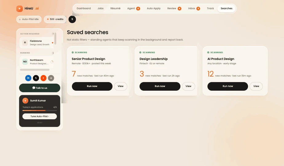
Saved searches — standing agents that keep scanning
Find, standing
A saved search here isn’t a static filter a candidate has to remember to rerun — it’s a standing agent that keeps working in the background and reports back with a match count.
Each search agent is named and scoped plainly — “Senior Product Design · Remote,” “Design Leadership · Fintech”
New-match count is the pull that brings the candidate back, instead of them needing to remember to check
“Run now” available on demand, so the agent never feels like the only way in
Turns a one-time search into ongoing coverage, without asking the candidate to babysit it.
Concept validation and design learnings. No shipped business metrics are claimed; match scores and scanning volumes shown in the interface are illustrative.
For a 0→1 AI product, a flow can be easy to use and still feel unsafe. Testing had to check whether people understood and trusted the system, not just whether they could click through it.
Test tasks
Can users understand what HireU.ai does and why a job matched?
Can users complete the flow — review, edit, and approve an application?
Do users trust what’s about to happen enough to hit approve?
Find a relevant Product Designer role and explain why it matched.
Review AI-generated résumé changes and edit one before accepting.
Approve an application and describe what happens next.
Locate an application that needs the user’s attention today.
I designed HireU.ai from the ground up as an AI-powered job application agent that simplifies the complete job-search journey — from discovering relevant opportunities to preparing personalized applications, automating repetitive ATS workflows, and tracking recruiter responses. The central challenge was balancing AI autonomy with human control: explainable matching, visible AI changes, approval gates, and a transparent activity log turn a fragmented process into one guided workflow, built around a single principle — let AI do the repetitive work, while the candidate stays in control of their career.
HireU.ai — 0→1 case study, concept exploration
The more responsibility AI takes on, the more important visibility becomes — not less.
This is exactly why the résumé diff view exists — it’s the one screen that makes this principle real.
A match score becomes useful the moment a user understands why it’s right.
The 92% score alone means little — the accept/gap tags next to it are what let someone decide.
Not every action needs confirmation — but consequential ones always should.
That’s the whole logic behind the three-level risk framework earlier in this case study.
Not fewer screens — fewer repeated actions and less context switching.
Eighteen manual steps became five reviewable ones — not by hiding complexity, but by removing repetition.
Traditional UX asks what the user should do. AI products also have to answer what the AI is doing.
The AI interaction model — discovers, explains, prepares, asks, executes, tracks — answers this on every screen.
Browse jobs, inspect the explained matches, review résumé changes, and explore the approval workflow in the interactive HireU.ai demo.
LET’S TALK
I'm open to Senior Product Design roles in Dubai — AI platforms, enterprise products, and agentic experiences.